Tuesday, 24 May 2011

Identifying Tools and Materials 3

For my 2nd Illustrator who uses Collage, I chose Dave McKean. His work is incredibly powerful , dramatic and dynamic. I looked closely at his illustrations for Heston Blumenthal's Big Fat Duck cookbook, because of the range of styles, some of which are below. I love his energetic fast flowing ink work and the way that he combines that with other elements such as photography.


His work is very complex and I found it quite difficult to work out exactly which parts were photography, which were painted, ink etc and how he went about collaging and layering the image together.

I decided to take a simple image to start with. So I opted for the Jazz Lady visual that I produced for the last Assignment, which I always felt lacked a bit of depth and decided to add a bit of Dave Mckean style to her.

First I took some music, photocopied and tore it up - (the subtext being 'improvisation' - the implication being that this music throws out the rule book and rips up the score)

then I painted over the music with some bright blue acrylic with free flowing strokes - to get some texture and some 'bluesy' colour.

I photographed and then cropped in the computer. I had intended to paint over the top but the texture was a bit too rough for that...

I then did a brush and ink drawing of the Jazz Lady 

 And then coloured her dress and the double bass in the computer, before adding the texture and playing with the mixes and opacity.


With text this might work the best... although I decided to try a different colour scheme and see what the result was.

I rather liked the hot colour version that I tried - in fact it's got more atmosphere about it I think - I also quite like the cropping on this one.
Although this is just a dabble into the techniques of Dave McKean, I think that it has given me some ideas to use at a later date. 


Wednesday, 18 May 2011

Identifying Tools and Materials 2

I chose to look more closely at the work of Dave McKean and Joel Stewart.

First I had a quick go at drawing in the style of Joel Stewart trying to work out where he had used 'physical' collage and where he had used the computer:

I took his cover page, which I think summed up his vision for bringing a modern twist to the Fairy Tales of Hans Christian Andersen. He has used the convention of the Victorian Stage which complements his cold stylised faces - and creates a nostalgic wistful atmospheric quality to his illustrations. The characters assembled are from different fairy stories, and are ephemeral, somewhat nightmarish - nobody is looking at each other they are all in their own little worlds ready to tell their stories.


I used pastel as he did, but without the intensity - however it gave me a feeling for how Stewart works. I'm quite pleased with the results - but it is clear that he must have used collage to get some of the clean lines between the different textures. 
I then took a visual from the Book Cover exercise (James and the Giant Peach) and rendered it in pastel but using different papers for the curtains, the sky - the peach itself and the waves. I intentionally made the waves like a Victorian cardboard puppet theatre set. I then cut the papers out and stuck them together - this is the scanned version.


Just for good measure - I then had a go at ripping up some images from a magazine and just seeing where the wind took me with a collage of the same image done in no particular style without the framing device and I'm quite pleased with the results.

James and the Giant Peach being attacked by sharks - ripped up magazine pages

As a break My friend with whom I am doing this course and I then had a bit of a play with some buttons.  I then photographed the image and put it into the computer to see if I could cut it out and place it on another background out successfully - not bad


Computerised, will have to see if I can put it onto a field at some stage


I then had a go at imitating some of the little carbon paper monoprint icons that Joel Stewart had used in the Hans Christian Andersen book with limited success. I took some small images from James and the Giant Peach again, and simplified them... the results were a bit disappointing - they worked best when I had very damp paper and a blunt pencil so that the bleed was more random... I'll return to this technique another time when I've got more time to experiment.

See my attempt to emulate Dave McKean's work in the next blog!

Identifying Tools and Materials

I decided to look at various illustrators who use Collage in its many forms. There is photo collage, paper, tissue, background collage, digital collage.... etc etc. Part of the reason for this choice was that I would like a bit more textural depth in my images and this might be a way of developing it. I discovered a vast range of techniques - some of which I have dabbled in, but it left me inspired to try all sorts of  new things.
From Amelia's Anthology Pikaland

Lesley Barnes - series of cards
I was most impressed with the intricate work of Lesley Barnes (above). It's all about style. Her figures are very cold - although there is a sort of fairytale nightmare feeling to her work. From reading about her, it seems that she uses tissue and acetate - cuts and scans and then puts it all together digitally. Her beautiful animation Herzog and the Monsters will stay with me for a very long time. It's technically brilliant. I would love to create something like that - maybe one day!


Lesley Barnes Firebird

Alicia Buelow
This combines photography, drawing text and demostrates how you can manipulte drawings by using all the available tools in the computer.


Alice Feagan - kids and cobblestones
This is the exact opposite, it's paper cut - traditional collage.

Amy Wasseman - Postcard
This Amy Wasseman postcard combines textures and photography to create a disturbing landscape with a dollop of the surreal about it.

And then there is Lauren Child who combines drawing and photography and uses the computer to collage it all together to create her very distinctive picture books. 


She has branched out into other forms recently with a wallpaper range for Liberty
Wall paper design by Lauren Child

This image was done by Child for the Dulwich Picture Gallery - it is a self portrait and demonstrates the key aspects of her personality - I like the tree and the use of text. She has a very light way of using text which absolutely complements her images and the stories she is trying to tell.


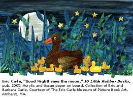
 Then there is Eric Carle who hand colours layers of tissue paper and then cuts then up to create his collages.

 Dave McKean - has to be one of my favourite illustrators using an incredible range of skills in his illustrations. I love 'The Savage'


Wolves in the walls uses great painting techniques combined with photo collage - again the dark mood is  invoked with use of distortion of the wolves faces and the unsettling perspective on the wallpaper - you can look inside Wolves in the Walls and Savage. His sombre colour choices add to the mood and the textural use of paint and collage and text give a rich depth to his illustrations. (I must remember 'Varjak Paw' for later in the course when we distort a cat or dog!) 


Also I really admire the work Of Joel Stewart, particularly a book which my children have - 'Tales of Christian Anderson'
In it he has used collage, bits of different textured paper combined with pastels and ink and put them all together in the computer. He displays many different styles within this book although they hang together  to create scenes in a sort of Victorian Puppet theatre.


He also (on another note uses lovely little carbon paper monoprints - which I must try!)

THERE ARE MORE ILLUSTRATORS IN MY LOG BOOK!