Tuesday 24 April 2012

All 7 days together

The brief I had written myself was a magazine editorial about the lives of different women in the 21st Century... and this week it was featuring a working Mum...


Monday - trying to remember everything for the week ahead

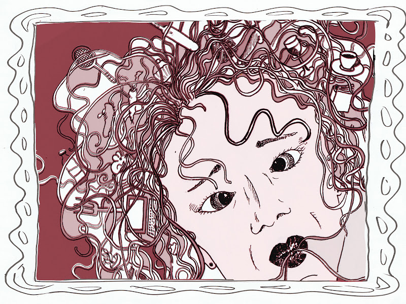
Tuesday - getting in a muddle - spaghetti head

Wednesday - wet and weepy

Thursday - dreamy contented bubbles

Friday - juggling act

Saturday - tidy home, tidy mind - calm

sunday full bright and breezy

or: Sunday -  happy rosy tinted

Conclusions
I think that the brief I gave myself was not particularly helpful.  In the final analysis, the series of illustrations just about hang together with the help of framing devices and the icons. Having said that, Monday and Thursday are definitely different stylistically to the others and perhaps in retrospect I should either have gone for the same style for each day, or opted for totally different styles. Initially I was intending to make them all very different according to the overarching mood of the day, but actually they have mostly come out quite similar to each other. I am not sure how this would play out in an editorial of a magazine, perhaps some of the images are too detailed, and in some the detail is too small. I think that the colour choices work out ok, and evoke the sentiments that I was after. I rather wish that I had chosen a different brief for myself, but it's a bit too late for that now!! It's a shame, the result is not as good as I would have hoped for my final piece of work on this course.


7-Days Saturday

Saturday means cleaning and tidying... so getting all the icons into their proper place... 
I drew an ink drawing to start with, and then added peaceful colours and collaged tissue paper to give the image a bit of texture.


Now it's time to see if they all hang together at all.

7-Days Friday


Friday is a day when I have to Juggle a great deal of stuff. I stuck to the visual, but decided that the jigsaw was too much, so I created a lino-cut and used a good positive 'red' - the family is all together at the end of Fridays so I wanted to get them all in to the image. It's intentionally ambiguous as to whether they are admiring or wondering what on earth I am doing or counting the things I am juggling. I quite like the clarity and simplicity of this image. I was going to do different colours, but I decided against it. Again I am hoping that the use of the icons will provide continuity.


7 Days, Thursday

Dreamy Thursday,

I should say at this point that I have used myself as a model but I have deliberately played with my self-image, so that these are not supposed to be portraits but representations of myself. So,  in this one, I have made my face significantly more attractive than it is, and younger, and more bouncy!

I intended to do a different and appropriate frame for each of the images, hence this one is gold plated and has the 'bubble' motif. This framing might have got a bit lost in some of the others now.


I rather like the lightness of this image but I want a slightly more 'other worldly' feel about the image and slightly intenser colours.


So I enhanced it in the computer.


7 Days - Wednesday

Wet and Weepy Wednesday - I went for a blue palette for obvious reasons and used 'delfware' as inspiration. However, I didn't like my border, it was particularly badly rendered. So I tried a soft vignette and added some blue background texture (ink splodges and circles blown up)  to the image.

Then I added a frame back in
 When I looked again, I felt that the texture was too much so I made it a bit more transparent.


7 Days Tuesday

Tuesday was my muddled day,

I stuck to the visual and worked it into a black and white stylized drawing of my 'spaghetti head' with all the icons stuck in the spaghetti. I wanted a sort of Warrior 'Boudicca' feel about it... I may be chaotic, messy and a bit of a disaster, but at least I work hard!!! I also wanted a 'Medusa' element within it. I think that I can be pretty scary to the kids sometimes when I'm a bit stressed!


I then took it into the computer and had a play with hot spaghetti bolognaise colours 


Somehow, the regularity of the image and the central nature of it in the frame make it possibly a bit too 'straight' for a muddled day. So I moved it within the frame digitally.
Perhaps the spaghetti looks a little like a sort of Bridle, so I added a bit more background colour

I was a bit worried that the very 'central' nature of the framing, although intentional in terms of having resonances of classical illustrations of Medusa, might be a bit too comfortable, so i had another go and changed the framing


Although this way, some of the icons get lost, the result is a bit more interesting. 
Might need to add a drawn frame around it to make it tie in better.


7 days monday


The Idea behind 'Monday' was to convey a sense of getting down to business, trying to remember to do all the things that make up looking after children, work, study, school work, shopping etc.. I took a pastel self portrait and cut it up digitally to try to convey the feeling of trying to remember a lot of different things!  I then cut it up with scissors and stuck it onto a notice board with all of the little icons and notes to represent the different things that I try to remember to do over the course of the week.


This is the basic image for Monday, although I do rather like the first image, but it doesn't have all the icons which I feel need to thread through the 7 days to achieve some sort of consistency between the images. Perhaps adding a hand-drawn frame would help as well.


7 days sunday v2


I decided to have one more stab at a fresh approach to the design, I used tissue paper as a texture and coloured it in the computer. I'm quite pleased with it. I quite like the 'rosy tinted specs' nature of it and the clarity of the icons growing in the background, but the newspaper is too dominant.


Better..


Tuesday 17 April 2012

7 Days Sunday

Starting with Sunday, I have begun to work some of the illustrations up...

My first attempt at a pen and ink variety was too blotchy in the background. I want a flatter colour. Stupidly I didn't scan the image before colouring it... so time to start again!!

I'm happy enough with the composition of it, I like Hubby being off centre, and I look more relaxed in this version. The boys have made a bit of mess, which is frankly more like them. I'm wondering about rendering the image as a lino-cut and simplifying it. Perhaps it would be a good idea to do them all as lino-cuts... I'll think more about this one.

After scanning the black and white line drawing, I did a mixture of inktense inks and digital colour... I think it's spring like yellow and white, green and blues give it the right mood, but I'm not quite satisfied though. It's simple but not really very stylish.. I think that that's the problem... I quite like leaving the frame as a plain drawing though... hmm, lots to think about.


Monday 2 April 2012

7 Days 2nd post

I have had a lot of difficulty sticking to this idea... I keep wanting to try out other things, but I think i really need to keep at it... so with this in mind, I have worked up 3 of the days into a near 'visual' state...

SUNDAY
Bright and Sunny, we had been to the allotment as a family, planted some broad beans had people round for lunch and made some cakes, my 7 yearold had played football and gone to see a friend, my 5 yearold had had a peaceful time playing with one of his friends and it was one of those really happy days, when everything seemed good with the world. I want the colours to be spring like and reflect the positive energy, I like the idea of things growing effortlessly in the wallpaper background while I have a nice cup of tea in the foreground. However, my husband is unimpressed that he doesn't feature in my visual, so I think I might have to add him in, he didn't think that the inclusion a glass of beer in the background and the rolled newpaper really constituted his very active role in family life!!!
On the upside, I like the fairy tale 'Jack in the beanstalk' references in the wallpaper as well as the feeling of fluidity in the pen work, so I think I will keep this as a pen and ink drawing when I go to do the final image. Also, I'm not sure, if I am working on a bigger scale, whether the figures should be bigger in the image, and the wallpaper smaller,


I have also had the idea of the frames contributing something to the final images.... so I've collected a mood-board including a range of frames and mirrors.

MONDAY 
Monday is always when I try to remember a million different things for the week ahead... so I thought I would create a self portrait of a slightly harassed me, out of scraps of paper, bills, post it notes, old envelopes etc all pinned onto a notice board... 


TUESDAY
This particular Tuesday was a struggle the boys bickered all morning - my 5 year-old had a tough time at school, I had to go to work at the Riverhouse Barn Arts Centre and then hit traffic on the way home. I had to organize film club for the Infant School and then collect two 7 yearlolds, get them to tennis lessons, get back to pick up the 5 yearold at the end of film club, get back to tennis, miracle up tea for the boys and then something for us when Hubby got back. I used to be a normal human being with a job, and now look at me!! The idea is to have a broken mirror with shards of glass reflecting different icons coming down - yes, it was a bad day. But when I started, I felt that the shards of glass were too negative... so I tried the idea of a noodle head instead... I think that this is more me!!


I think that this sums up my lack of organisation, but most of the time, I find the funny side of it! 

WEDNESDAY
My mood was a bit soggy, and I didn't have any ideas for this OCA assignment, so I was definitely feeling sorry for myself. Rain and falling icons.... 

But when I started on the falling icons, I came up with the idea of everything I did getting a big soggy in the rain... again, I hope there is an element of humour rather that downright despair!

THURSDAY
A Happy Day - I love thursdays because they are the day when my friend and I concentrate on our OCA work and for a few hours nothing else is in my head. I nearly always feel hopeful and full of ideas at the end of thursdays so I wanted to create a happy 'bubbly' 'dreamy' feeling in this illustration.


This frame could be a  mirror reflecting dreams - I think I will go with a pencil drawing, or water colour pencils for this image, soft and dreamy... 

FRIDAY 
This is a frantic day, because I work at the Riverhouse Barn Arts Centre in Walton-on-Thames (which is a fantastic place) all day, and I'm have to get back in time to pick children up from school. Hubby is back from work earlier and I like to get everything under control before the weekend. I had the idea of a jigsaw - initially needing to be put together, but I think it would be better if it was completed or nearly completed and maybe the idea of the picture being me balancing on a unicycle with all the icons ontop of my head and in towers on my hands would work? 


I might try this as a lino-cut and forget the idea of the jigsaw, I get a feeling that I am mixing too many metaphors. I also quite like the idea of my family as a supportive and encouraging audience!

SATURDAY 
This is 'cleaning' day - Hooray. 7 yearold and Hubby go to football, 5 yearold plays while I get the house vaguely into some sort of order, this week we had people round in the afternoon evening to watch the rugby, but I think I'll focus on the tidying getting things in order aspect - maybe the icons should go into frames on the wall while I hoover in the foreground.


Now it's time to get on with executing the visuals - hmm.