Wednesday 28 March 2012

7 days

The Brief is very open for this final assignment - really it's anything we want it to be, which is causing all sorts of problems for me!!

I started off in my learning log, making all sorts of notes and jotting down ideas - having a bit of a brainstorm.

My first idea was to create an illustration for 7 days of 7 different people who somehow all meet each other, but it turned into a bit of a 'movie' script instead of an illustration!  I also considered doing a 'Bayeux Tapestry' idea of 7 days in my life.. but couldn't quite get going on that one when I went to the sketchbook.  Then I thought it might be more interesting to push my own interest in portraits and how to create a specific atmosphere with colour, medium and content... and try to push myself to do an autobiographical 7 days in which I chose 7 very different moods across a week and tried to portray them...

'The Brief' - a magazine is publishing a series about how 7 different women attempt to create a 'work-life balance' - it's called '7 Days for 7 Women' and you have been comissioned to create a series of personal autobiographical illustrations about a typical week in your life.

First a recorded the ups and downs of a typical week, which I won't bore you with here and then I had another go in the sketchbook with little success.

My first idea was to do self portraits of every mood and create a 'wallpaper' background with small icons that summed up that day. The idea was that this would provide a continuity between the illustrations. However, the thumbnails I did for this were all a bit 'samey' so I decided to allow myself more flexibility of style. I had thought that I wanted just facial expressions, but I now decided to go for full body in some, cropped face in others etc.


This gave me something to work on, the icons are the unifying element, hopefully. However but I feel that overall the feeling was too negative, and as I work each one up I'm beginning to try to put a bit more humour into the drawings, as I am generally able to laugh at  myself a bit more than these drawings suggest!!!

I also did a page of 'icons' to get me going... 


I have approached mood boards in a new way this time. After hearing about online moodboards and decided to try one out. 


I have created a moodboard for each of the days... and also collected some wallpapers etc that appealed to me. I'm not sure that this would work for every project but for this one, which I want to have a 'home decoration' theme, it is just what I need.

Tuesday 13 March 2012

Educational Strip

The brief was to come up with an illustrated stip of 5 frames for use in schools explaining to young teenagers how to cope with the onset of puberty. Humour and metaphor are suggested given the age group and the client would also like an illustration of the character for use on the front cover. The title is
'What's Happening to my Body, it's all going Mad'

Having two young boys, I decided I might as well find out what I have to expect in the coming years (oh how I'm looking forward to it) and did some research into what happens to boys and when!!

So apparently, Puberty hits as early as 9 (aaargh) - 13. It usually starts with a growth spurt up to 4.1 inches in a year. 1st hands and feet grow, then arms and legs and finally the torso catches up. Common issues are spots, smelliness, clumsiness, when to shave, how to speak to the opposite sex, greasy hair and rampant hormonal surges...

As this is a leaflet about the onset of puberty, I thought that it might actually be intended for children approaching teenage, otherwise it might be a bit too late! Knowing how 'silly' boys can be, I decided to go for humour so that they could laugh openly without having to snigger behind their hands...

I did a lot of visual braistorming in my sketchbook, with ideas of comic strips, graffitti lettering, journals, diaries, teenage jottings, texting, splitting the issues into days of the week....


I decided that my visual language would not be too 'trendy' as i was worried about a school resource needing to be useful for many years so i went for a pretty timeless style, using the Diary of a Wimpy Kid as an inspiration.


I played with ideas for metaphor, like werewolf hairy feet, a gangly giant trying to escape a black 'puberty' cloud which seems to be pursuing him, volcanic eruptions for spots... jungles for hairiness.

I liked the idea of a gangly individual, feeling like his whole body has gone bonkers.

I began to put these into 5 frames for a standard leaflet that folds out of a page of A4. So I decided on a front cover, and 5 pages covering the following subjects: When to expect it to start, Growth Spurts, Spots, Hygeine and Shaving.


I then worked these up into individual pen drawings. 


After that I scanned them in and added flat colour and corrected a few mistakes etc in in the computer. then I laid them out for printing on both sides of an A4 sheet. 


I like the combination of fluid drawing and flat colour, although some of the images are more successful than others. But I think that the overall idea of a gangly youth, beset by slightly embarrassing problems presented in an easy non-confrontational, non scientific, humourous way with informative hopefully helpful notes and jottings around the charcter works quite well. I also think he is pretty timeless and so slightly less embarrassing, as it doesn't come across as grown ups is trying to 'talk teenage' which is somewhat embarrassing!


Working for Children - Sad Dog final post

The Final Images 
7-9yrs

I worked in Charcoal and smudged and erased - I could see this working within a book or as a book cover... It ended up a bit more 'cartoony' than I had originally intended though.
This version in pencil wash had a sadder expression, maybe I should have added bars to this one??

I also tried cropping the initial image to see if the feeling of un-ease would be enhanced..


I think cropping does add to the atmosphere, but the full image tells more of a story so might be better on a front cover.

The version for the younger children was tricky...
At first I did a very intricate pen image... but it was too fussy for the younger readers I think, and I kind of lost interest in it as I worked on it... I tried adding colour, but that made it worse. I rather wish I could go back and carry on working into the black and white again, but it's too late now, it's gone!! 

So instead, I decided to simplify and stylise it... 


I then scanned different papers, tissues and velvet and collaged them onto this sketch using Photo-Deluxe.. I am quite pleased with the resulting image


Overall I like the different textures that one can achieve within a line drawing doing it this way... It was good to experiment with and I think you do get the idea that the dog has dug up the whole garden looking for his bone. Maybe it needs a few more different colours or shades though?


Good exercise... nearly what I wanted, but not quite!! Again.


Working for Children - Sad Dog

First we were asked to pick 2 age-groups of readers...

I decided to look at the age-group (3-5) encompassing a wide range of abilities and sophistication but probably a full colour book with a couple of lines of text.

In contrast, I went for the 7-9 age-group of Established readers (assuming that I would be illustrating a fairly 'wordy book, so this would not  be a full page illustration)

I then decided on a word from the list: 'Sad' - and after brainstorming around it with spidergrams, I settled on a dog, as there's  nothing quite like a dog for tugging at the heart-strings!! Particularly a Basset Hound!

Thinking about the two age groups, I made an early decision that humour should be a factor in the illustration for the 3-5 yearold bracket. I wanted to create a 'scene' around the dog...

I wasn't so sure about the older age group - but I thought that they could be asked to cope with a more hard-hitting sadness, something like the experience of abandonment, cruelty, or being lost. A book I looked at for an earlier exercise was 'Harry and Hopper' about the death of a dog, in which the illustrator Freya Blckwood used an ephemeral soft wispy pencil line as 'Hopper' vanishes from Harry's life. It's aimed at the age-group 5-7 I would think, but it's sensitively approached.

In my sketchbook I played with some thumbnails. I established a scene for a bassett hound. He had lost his bone, dug up the garden looking for it and then given up, but unknown to him, the bone is sticking out for the reader to see under the island he is marrooned on!!


I tried various sketches to achieve the droopy eyed sadness I was after.

for the older age group, I thought that a caged dog, might be a simple image to communicate sadness, 
I also looked at other sistuations - going away, abandonned outside in the rain, wanting a walk, lost in the night miles from anywhere....


I eventually settled on Basset Sadness


And wire mesh, instead of bars...

So the decision for both images was made... the next job was to try to get them onto paper.


Wednesday 7 March 2012

Working for Children

As a parent of a 7 and 5 yearold, the house is pretty full of imagery for children from birth to age 10. I am constantly looking at what is on offer. There is so much on offer that it is really impossible to put anything sensible on paper. I am not sure that there are really any hard and fast rules about illustrations for different ages, but the way in which one communicates an emotion or a situation might change... or it might not... An example of an illustrator who appeals to ages from 0-100 is Quentin Blake - and he does this without really changing his style of drawing, just by adding detail.

Angelica Sprocket (2010) has something in her many pockets for every occasion …‘Mister Magnolia’ was first published in 1980.  He celebrated his 30th birthday in 2010 – still with only one boot!
But to go back to the beginning.. 
For Baby and Pre Readers, there are developmental stages to observe... what colours and shapes they can recognise through to understanding the way that words and sentences are formed. Initially my children has black and white books as that is the way we first see the world.  After that we had to  have cloth books that they could suck which had complementary colours to stimulate them... but then the fun stuff started...

Some of the best early books are tactile - featuring different textures for sensory stimulation. One of the best examples is the Touchy Feely series published by Usborne and illustrated by Rachel Wells. They are packed with different shiny scratchy and slimy things to touch and a mouse to spot.. (6months-18months but my kids came back to them when they started reading)

Then there are books that develop language skills e.g. Opposites Maisy's book of Opposites - is a good example of this... by Lucy Cousins (ages 1-3)


Up to this point illustrations are the main thing and the words are minimal. From there we begin to get stories developing  - my children loved the Mick Inkpen stories (Kipper and the Lullabyhullabaloo - simple appealing characters with expressive faces - and very funny prob 2-6ish). The stories and illustrations are often best done by the same person as they need to work seemlessly. Helen Oxenbury's classic 'Bear Hunt' stimulates the imagination with simple drawings. Interestingly they did bring out a pull out book of 'Bear Hunt' but my children were so obsessed with pulling the bits that they missed a lot of the story itself, so I hid it away and we found we enjoyed the plain book much better.

Children's books develop the idea of sentences and reading from  left to right (in English) The  Duck books are bright and cheerful by Jez Alborough (2-5) and the children used to look for picture clues to predict the mishaps that would befall the Self important Duck character.


They are bright, cheerful, characterisation is uncomplicated and humourous and they are great for introducing the idea of reading....
They also loved the combination of photo montage and illustration in the Lauren Child books. 

Axel Sheffler's illustrations always have wonderful details and simple humour in them, again the animals are never too scary e.g. Gruffalo is funny not scary even though it is clearly scary in the context of the story. (2-6) - How to deal with 'Scary' and 'Sad' stuff in stories is a very interesting problem for the illustrator. You have to hint at scariness without giving the child nightmares.


 The Sir Charlie Stinky Socks books by Kristina Stevenson do 'scary monsters' really well and they combine text and image very succesfully, with a playful use of fonts and pull out flaps etc. (ages3-7)


As children start to read they really enjoy books that give them more details in both the story and the images to get stuck into... Winnie the Witch has fantasticly grotesque gothic images, but the boys love them. (4-8)

As children develop they like to role play adventures and the 'Dragonology' books are great for this. They are packed with maps and pull out flaps, letters, documents, fake facts all presented as if they are a historical scientific record (ages 6-12ish). The illustrators have taken inspiration from old maps and documents and they are presented as if 'real'. 

 Then there is the presentation of History - Horrible History style. This series has hit the mark big time. The Cartoon illustrations compliment the presentation of the historical facts... it's a grotesque and funny representation of some pretty ghastly moments (6-16)


Oliver Jeffers 'Incredble Book Eating Boy" is one of my favourites. I love the use of pages from old books and different texts along with the simple sketches. I first read it to the boys when they were 2 and 4 and they have recently re-read it and they commented on the illustrations which they think are fantastic... there is something 'naughty' about tearing out sheets from a book and painting over them and this is part of what appeals to them. 


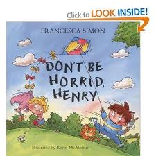
Horrid Henry is a particular favourite.. there is a picture book version for younger children, with more colour and less 'horribleness' 

Tony Ross's simple prints are wonderful characterisations and Kevin McAleenan has clearly just made Henry a little chubbier, less 'evil'  looking and more approachable for the younger audience - gently leading the reader towards the original Horrid Henry books which my children have picked many bad habits up from. 

The illustrations in the established reader e.g the Beastquest illustrations are quite scary for younger readers as they are quite ferocious and fiery and adult in their use of 'fantasy', inside they are quite traditional almost like old fashioned etchings that is in keeping with there style. The images become less important to the text at this point - they are more 'dressing'

On the other end of the scale - McKean's illustrations in 'Varjak Paw' 

and 'the Savage' are also very 'adult' they do not condescend to their readers, but they add so much to the stories... it is impossible to imagine the books without his illustrations.

There are also Graphic Novels and 'comic strips' available for this age group... and also for established and developing readers. This is an interesting area...

As children develop - they are able to appreciate more complexity in both text and image, and both visual and cognitive imaginations can be increasingly stimulated - and so illustrators often employ more subtlety and suggestion within the imagery according to the age of the target reader.
I think that this developing ability is really the main difference between younger and older readers, but that is not to say that the simple and direct has to be purely used on the younger ages, it can be extremely powerful across the board.

Tuesday 6 March 2012

Packaging 2 - Sabre Snaps


I worked up the Sabre Snap Ginger biscuits with an Ink drawing...

I then added some colour in the computer

I tried a bit of digital drawing on the typography... 

and added photos of gingersnaps

I quite like the biscuits in this one.. although they could be more cookie like... and I wonder if it would be better with a bit of texture in the card...


Then I had a play with some texture, but I think that this washes the design out a bit. I could put some white back into the tiger... I like the biscuits though


It was a bit dull, so I played with another colour... to brighten the image up and make it part of the same family as the DoDo image.

I think I need more white on the tiger and the dark lines have gone a bit too dark in the transfer.... but might have to leave it now!!!!!


I think that although these are not perfect, they would work as visuals for a client to give a general  idea of the design and to start a conversation - although obviously I would have to work on the side details and top and bottom of design more