I looked at fonts on my mac, but they appeared quite limited, i felt I learnt more from experimenting in my sketchbook..
Big and Small
the most successful 'Bigs' had perspective and seemed to be heavy, massive... black and red seemed to have the most impact... Small needed a degree of fragility, and worked best when seen to be small in relation with something else.... blue and yellow and pink worked quite well.
FAT/THIN
Fat and thin were a bit more fun!! Fat has connotations of 'eating too much' unhealthyness, overindulgence etc. Thin can be fragile and flexible or brittle.. a lot to play with. I had a go with wavy letters which seemed to be blowing in the wind as well as very brittle looking thin typography.
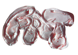
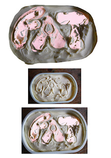
Fat could be more rounded than Big was, wobbly, made of cigars, slightly shiny!! I decided to have a go at something a bit different. I wrote Fat in a tub of margarine and played with it on the computer.
I then photographed a chain and wrote Thin with it on the mac.
I'm quite pleased with these.
FAST SLOW
This was tricky... the fonts on the mac were too limited really to get any feeling of speed. I tried distorting them so that they leant to the side... to get a feeling of fast movement, but wasn't really happy with any of them. Fast seemed to demand a style that seemed easy and quick to complete - slow needed a plodding squatness.
I didn't get round to adding colour, but I think yellow (speed of light) or red or orange... although Green is for go - think it would depend on contrast of background and foreground, they need to clash!
Still unhappy with slow, I decided to draw it in Treacle and then photograph the image.
I rather like this, it looks like a snail has slowly written it across the plate. The brown colour was quite good for 'slow'
FUN/BORING
Another one that the mac didn't really do justice too, just shows how unexpressive some of these fonts are even if you add all the frills!! 

I enjoyed playing with fun, adding fur, eyes etc..
But to get another take on it, I decided to get some fun sweeties and write the word with them.
I think that this last one is the most Fun!!
Boring was... well. boring... had to be plain, grey/brown dull coloured, square no frills typography, dull as can be.. not much to play with.
CALM/MAD
Mad has two very different meanings - a dark brooding or frightening madness or 'I'm mad me!!' fun! Either way, I struggled to find anything that worked well on the computer.
Calm meanwhile is blue and gentle and soft round-edged unrushed, perfectly formed (feminine?) easier to find on the mac.
While I didn't come up with much that I would use - I do think that this helped focus my mind of the part that typography can play in illustration.


No comments:
Post a Comment