Wednesday, 30 March 2011

Assignment 3 - Jazz evening post 1

For this assignment I chose to continue the Jazz theme by creating a Poster for an Evening of Jazz.

I started with a Spider diagram.


And assembled some textures, using ink and resist swirls, different materials and colours and some reference material from the internet.


I can't credit these, but these early posters hark back to the golden age of Jazz and I thought about how I might use this idea but put a twist on it. 

So I went for the old sketch book and jotted down a few thumbnails.


I was torn between wanting to capture the spirit of improvisation and the idea of the blues. The thumbnails gave me the idea of using cool bluesy colours in the background and hotter colours for instruments/instrumentalists. I chose to work up the chopped up instruments idea, which was based on the idea that I had for the Miles Davis Abstract Exercise. 

Visual 1
I experimented with using notes to create the font. I quite like this, but the downside when I did the colour visual was that the image itself became rather constricted.


So having got this far, I hit a bit of a wall and decided come back to it later, but for the moment it seemed better to try other ideas.

Assignment 3 - Jazz Poster - post 3

My 3rd attempt was of a Blues Lady. My initial concept was to play on the shapes made by a blues singer, the lights and the instruments.


As I worked on her, I felt that she was crying out to be abstracted to another level.

I went for a more fluid background instead on this version, but it appealed more to me, so I went for a bigger version 

I went for a hand drawn font again. as none of mine seemed right. I then photographed and played with the background in the computer.

final Blues Lady Poster
this texure echoes the texture in the background of the central image I washed it with another layer of colour.

Final Blues Lady v2
and this texture is the same one that I used in the 2nd Poster. I'm still not sure which I like best. 
I am quite pleased with this image, it looks like a good night would be had. She seems passionate and there is a bit of rhythm implied. In terms of process, I seem to wander away from the visual when I come to creating the final image. I think this will come with experience but knowing instinctively when something will work and also knowing when to stop are both things that I have to work on!

Assignment 3 - Jazz Poster Last Post

I have been working on several versions of the Jazz Evening Poster. I have split them up in my earlier posts, but they have actually been in development at the same time. I decided to revisit the chopped up instruments.


I wasn't happy with the text on it, so I tried another tack. I zoomed in on the central part of the design and decided to put text on that instead.


I wanted the text to be clean and to stand out, but also to have some fluidity. So I warped the text, duplicated it and used the duplication as a highlight to give it a lift. I tried two different backgrounds again. The original blue ink texture and also a plain gold colour pipetted from the trombone shape which balanced the colours a bit better - looking at it here though - it might be a bit flat. 


Final Jazz Night Poster


Actually looking at this post published, maybe all it needed was a white background. Again, I don't seem to be able to stop fiddling!


Assignment 3 - Jazz Poster - post 2

The 2nd idea I worked up was a straighter piece with references to the Deco posters.

I wasn't sure what to put in the background, when I started experimenting with colour patterns, the whole thing began to feel a bit too busy. Also the greens for the drums added one colour too many to my mind.
I persevered with a colour version in guache... 


I added the faded words as a texture in the background. Then I photographed the image and put a border on created from the ink texture in my mood board. Not sure about the figures, I wanted to give them a hand drawn sketchy feel, but I'm not sure that this was a good decision, perhaps it needed the crispness of printing.

Final version of Evening of Jazz 2
the whole effect is a bit bland!

Making a mock up

For this exercise I decided to follow the brief for the Penguin Design Award - James and the Giant Peach competition. I'm not going to enter it, but I wanted to see if I could follow a brief through.

I started with jotting down the most memorable images from my own reading of the book, first when I was a child and later to my own children.

Bearing in mind the space required for the text on the brief, I did a few sketches. I refered to the book to develop the images that were clearest in my memory. These were: Sponge and Spiker - the cruel Aunts, the Peach growing on the 'dead' tree;

 the Peach being attacked by sharks and lifted out by silks attached to sea gulls; the Peach crashing through the rainbow,

and the peach impaled on the top of the Empire State Building.

The brief called for a new interpretation, but it also dictated the exact text - including the words 'illustrated by Quentin Blake" - this gave me cause for some concern, because, nothing is more irritating to me than having images on the front cover of a book which clash or tell a different story to the images inside. For this reason I decided to reference the Quentin Blake illustrations incorporated. I also decided to go down a slightly Tim Burtonesque route. This was partly because the text for the back cover was quite dark,


Introducing James Trotter and his aunts, Sponge and Spiker.

James and the Giant Peach

An enormous escaped rhinoceros from London Zoo has eaten James’s parents. And it gets worse! James is packed off to live with his two really horrible aunts, Sponge and Spiker. Poor James is miserable, until something peculiar happens and James finds himself on the most wonderful and extraordinary journey he could ever imagine 

As it also mentioned James and his two Aunts, I felt that I wanted to see them in action so, again I felt it important to reference Quentin Blake's illustrations. I went back to the text for descriptions of the Aunts and the Insects. I deliberately avoided copying the Blake Illustrations, but incorporated many of the same elements, so that the cover and the internal illustrations would work together.

 I wanted continuity between the spine and the front cover. I also considered that the peach and a creature should just be visible on the spine. I tested out the available space for text by making a visual mock up. 


In terms of colour, I wanted to keep a limited palette, with the Peach standing out as a beacon of light symoblising James Adventure against his drab, unpleasant colourless existance with his two aunts. I decided that the peach colour would be most dramatic in terms of standing out on the book shelves if the background was black. This fitted as most of the adventure takes place at night, although I stretched the point by spreading the black to the background of the New York city skyline, mainly for impact and also because it enhanced the dark fairytale quality that I was after. 


I then played with various fonts, but in the end I decided to go for hand drawn fonts, which I drew onto tracing paper, scanned and then re-inforced on the computer. I used Charcoal (the most natural that I could find on my computer) for the precis and the information on the back cover. So, this was the final mock up:


It was a very useful exercise working all the way from the brief - and I love this book. If I were to have entered the competition, I expect that they would not have liked the fact that I kept close to the original Blake illustrations, but personally, I think it works quite well. 


Thursday, 24 March 2011

visuals


We were asked to do the process of client visuals in reverse. I chose two different pieces. One was the Book Cover for Louis de Bernieres Senor Vivo and the Coca lord published by Minerva Fiction. 


I approached this with a line drawing.

However, I think that colour was very important to this design, and I wonder if the client would have wanted that in the visual. I might give this a go. The elements that are incorporated are easy to read and the font is discernable, so I think that the client would have had a good idea of the design, but I don't think I could have reduced it any more than that.
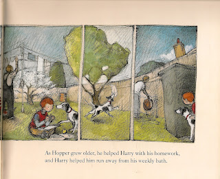
The 2nd illustration I chose was from a book which my son loves - Harry and Hopper by Margaret Wild and Freya Blackwood which was shortlisted for the Cilip Kate Greenaway Medal 2010.


I could see the Art direction behind this clever illustration, the changing seasons, the different activities and the pan around the garden. There is something incredibly satisfying about the way that this illustration was put together.


My visual shows you how it was laid out in the original, although the 6th panel has floated away a bit. 
Again, I think that there is not much more than can come out of this visual. Unlike the first, the colour is less important however, so I would imagine that this might be pretty much all that the client might have  needed. 


I love this artist's simple but evocative soft use of pencil. The book is about bereavement and the dog becomes less and less distinct, the lines which had showed his puppy like movement initially become fainter and he becomes transparent - it's a very delicate and clever use of the medium. 


Wednesday, 23 March 2011

Viewpoint 2, Workshop - Sketchbook images

I turned to the sketchbook and did a number of fast sketches in rectangular and square formats. Here are some examples


I decided to go onto a bigger sheet of paper. 


And then to try some entirely different shapes out. Because I had laid the objects out at random angles, these didn't generally work as well I don't think. Although I do like the regular circle and the oval might have worked. The triangle would work as a pleasing image, not sure about whether it communicates the right idea though.


I quite enjoyed playing with the different frames, and the perspective slightly in the round frame, which actually gave the image a hint of Globe about it and I quite liked the idea of this globe shaped frame holding all the parts of the workshop within it, 'My world'.

However my favorite and the one that I worked up was the more conventional. I liked the fullness of the images and their proximity to the edges of the frame, the feeling that there was much more going on outside the frame and that they items had been flung down in the middle of a project.


Viewpoint

This exercise was designed to make us consider the meanings communicated by the use of different framing devices and viewpoints.

I chose to work with a collection of 'Workshop' tools roughly laid out on a wooden table. The idea I wanted to communicate was that the craftsperson had just laid down the tools while he/she had a tea break. I set about photographing the collection from different angles.


Different textures
Aerial view 'flung down'
tighter flung down and textures

like contrast of blade and leather


 I like this photo but it doesn't communicate what I need
Favorite photo, shows the busy worskhop I was after


More textures

framing device looking through the belt

A bit too neat looking for the effect I was after

As photographs I liked the close ups that were a bit abstract, but the most successful in terms of communication the most successful were the photos that showed a more haphazard collection and the ones that looked the most crowded within the frame. The next part of the exercise was to turn to the sketchbook, see next post