We were asked to do the process of client visuals in reverse. I chose two different pieces. One was the Book Cover for Louis de Bernieres Senor Vivo and the Coca lord published by Minerva Fiction.

I approached this with a line drawing.

However, I think that colour was very important to this design, and I wonder if the client would have wanted that in the visual. I might give this a go. The elements that are incorporated are easy to read and the font is discernable, so I think that the client would have had a good idea of the design, but I don't think I could have reduced it any more than that.

I could see the Art direction behind this clever illustration, the changing seasons, the different activities and the pan around the garden. There is something incredibly satisfying about the way that this illustration was put together.

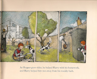

My visual shows you how it was laid out in the original, although the 6th panel has floated away a bit.
Again, I think that there is not much more than can come out of this visual. Unlike the first, the colour is less important however, so I would imagine that this might be pretty much all that the client might have needed.


I love this artist's simple but evocative soft use of pencil. The book is about bereavement and the dog becomes less and less distinct, the lines which had showed his puppy like movement initially become fainter and he becomes transparent - it's a very delicate and clever use of the medium.
No comments:
Post a Comment